• Home
  • Research provided
  • About
  • Giving back
  • Sharing
  • vanddraabe
  • Contact
  • intro-retro (Blog)
exeResearch

introspective-retrospective

Survey of Popular Data Analysis Tools

7/30/2018

Comments

 
Idea for new plots for additional insight to the data.
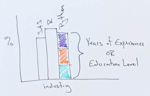
New plot with industry on the X-axis and percent of responses on the Y-axis. Each industry has three bars representing the three analysis tools or the three years-of-experience or three education levels.
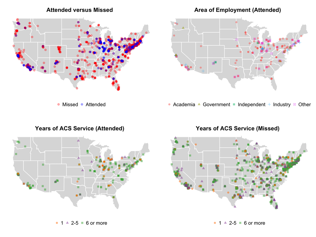
Burtch Works released the results of their 2018 SAS, R, or Python Survey Results: Which do Data Scientists & Analytics Pros Prefer? survey (also available on YouTube). The results are provided to help those seeking a job in the data science or predictive modeling and analysis fields to understand better which data analysis tool is most popular in the different areas. The survey asks respondents to provide information about their professional career; preferred data analysis tool, highest degree, industry, and region of the United States. They have been performing the survey since 2014, but in 2016 they added Python to the initial list of preferred data analysis tool; SAS or R. While I found their survey interesting, it left me with the following questions.

Why has Python’s popularity increased?
The Burtch Works’ presentation does not explore the increased popularity of Python. One possible reason: Python is a general programming language, while SAS and R are considered specialized tools for the statistical analysis of data. Thus, Python is a flexible programming language able to create standalone applications -- e.g., web applications and games to name a few -- whereas SAS and R are statistical analysis languages first. It is Python’s flexibility that has allowed the addition of data collection and analysis packages. 

Another likely reason for the increase in Python’s popularity within this survey, Python is a common first programming course for (computer) science majors. Thus, students learn Python, use it throughout their education, and then continue using it in their career. It does not matter if they go on to write software or become data scientists. They have been using Python for at least four years when they graduate and Python has the ability to adequately fill so many computer science roles -- from applied applications in the business world to scientific fields such as computational chemistry (see OpenEye Scientific Software, Schrodinger, and PyMOL) to other academic research fields -- no other programming language needed. Additionally, Python is open source (like R) easily links to a GUI toolkit, and can use numerous third-party packages (also like R). It is very understandable why it is a favorite and accessible programming language to learn and continually grow.

Why is SAS dominant in specific industries?
SAS is dominant in the Financial Services, Healthcare, and the Pharmaceutical industry. Compared to the other represented industries (Technology & Telecommunications, Consulting, Advertising & Marketing, and Retail), it is understandable SAS’ domination in these three areas. The Financial, Healthcare, and Pharmaceutical industries have long relied on the data analysis to create products and make better decisions. An often overlooked aspect of selecting a software platform is user support. SAS provides clients the ability to talk with a SAS expert, receive SAS training, and get relatively quick answers to questions about SAS from SAS. These features -- often not initially thought of -- are huge benefits when selecting a software package. Another possible reason for SAS’ low use-rate in other industries is that these industries have recently started to adopt these tools to analyze their data and aid their decisions. 

More plots?
The survey results demonstrate SAS' popularity in three industries with a long history of using data analytics. However, modifying the “SAS, R, or Python Preference by Industry” plot to have each bar segmented by years-of-experience or education level would increase the information conveyed to the reader. 
​
Segmenting the SAS, R, or Python bars into the three years-of-experience ranges shows the relationship between years-of-experience and preference for a specific tool within each industry. Changing the segments from years-of-experience to education level focuses on the relationship between tool choice and education. To gain insight to the education and experience trends within each industry, have the bars represent each education level -- in each industry -- and then segment each bar into the three years-of-experience ranges. The additional plots add insight into the likelihood of a change in tool preference, hiring trends related to education, and the relationship between experience and education towards tool preference.

Comments

Why Eight 3s for a Free Slider?

1/23/2018

Comments

 
When the Spartans score eight or more three-pointers (3s) in a game at home this season, those in possession of a game ticket can get a free slider from Arby’s. This promotion is similar to the much beloved free Taco Bell taco when the Spartans scored 70 points are more. On the surface the free slider with eight 3s appears arbitrary, while the 70 points goal is understandable -- it’s a round number, and in some Big Ten games either team scoring 70 points might be difficult due to the defense-first philosophy of the coaches.

Taco Bell’s offer of free tacos was genius. Starting with the 2004 - 2005 season, as the Spartans approached 70 points the Izzone would chant “We want tacos!”. During games when the team approached reaching the point of free tacos, each attempt would bring oohs and ahhs from the crowd. A free taco was at stake. But why 70 points? Any number of points between 65 and 85 would be acceptable because a majority of Spartan home games ended with the Spartan scoring between 66 and 82 points at home between the 1995 and 2004 seasons.

In reality, any giveaway where you have to go to the store to redeem a ticket is meant to drive customers to the store. Taco Bell’s goal was not to limit the number of free tacos but to maximize the number of times people visited their restaurants. The likely goal was to have you visit for your free taco (current cost $1.29) and buy several more with a drink. Arby’s likely wants the same. Visit for your free slider (current cost $1.49) and buy a few more with fries and a drink. Unfortunately, we never know if these promotions drive customers to visit these locations or what else they purchased.

In the Tom Izzo Era -- since the 1995 - 1996 season-- the Spartans have scored 70 or more points in at least 55% (eight or nine games per season) of their games each season except for the 1995 - 1996 season where they had a single home game with 70 points or more. During the free taco promotion -- the 2004 to 2013 seasons -- 102 out of 161 home games (~63% over ten seasons) resulted in a free taco. The 2017-2018 season has resulted in free sliders for 9 of 13 home games (~69%). If the Arby’s Free Slider promotion were happening during the 2014 to 2017 seasons, the average number of free slider games would have been eight games per season (50% of home games) with the 2016 season resulting in ten games (~62%) with eight 3s or more.

Setting a scoring goal requires knowing what the team has previously done and expecting the past trends to continue. An easily achievable scoring goal is uninspiring while an overly demanding scoring goal is defeating. The following is likely how the organizers of the food giveaways determined the optimal number of points and three-pointers.

Spartan Home Points (1995-2018)
Pre-Taco Era
The above plot illustrates the Spartan’s score for each game during the Izzo Era and depicts the number of points scored in each game using the violin (vase) shapes; the girth of the violin indicates more scores at the value while the length represents the range of the score for all games during the season. Very thin regions of the violins indicate a low number of the score’s occurrence. The markers -- circles (Big Ten conference games) and squares (non-conference games) -- represents the scores for individual home games and are color-coded dark green for home wins and orange for home losses. The horizontal line drawn behind the violins represents 70 points. In the 1996 season, the Spartans scored a median of 63 points (equal number of point totals above and below this value) with a low of 47 and a high of 77 points.

Using the pre-taco era to determine the optimal number of points for the promotion, showed 74 out of 125 home games (~59% over eight seasons) would have resulted in a free taco using 70 points; either nine or ten games per season. During this time, the Spartans increased their median score from 63 points in the 1996 season to 77 points in the 2001 season followed by a decrease to 68 points in the 2003 season. Reducing the free taco score to 60 would have resulted in an average of five additional free tacos (15 free tacos) per season, while 65 would garner three more tacos (12 free tacos) per season. Increasing the need number of points for a free taco to 75 reduces the number by two (eight free tacos) per season, 80 by four (five free tacos) per season, and 85 by seven (only three free tacos) per season. Based on the Spartan’s past performance, selecting 70 points for a free taco was sound while 75 points would likely have resulted in free tacos for about half of the home games.

We Want Tacos!
During the reign of tacos, the Spartans scored 70 points or more in 102 of 161 home games (~63% over ten seasons) with the number of points scored in each home fluctuating around 75 points. The 2007 season was the only season where the average and the median number of points was less than 70 with values of 69.05 and 69, respectively. Interestingly, the 2009, 2004, and 2007 seasons had the fewest number of free taco games -- 7, 8, and 9 respectively -- compared to the 2005 (12 free taco games) and 2008 (13) seasons.

Unfortunately, the Taco Bell promotion ended with the 2012-2013 season and left a void -- in the stomach of students -- for several years. Had the taco giveaway continued, there would have been 61 of 76 home games (~80% over five seasons) resulting in a free taco; averaging 12 free taco games per season. The past five seasons, the 2015 season had the lowest average and median score of 74.2 and 74, respectively, for what would have been ten free tacos. The current season (2018) currently has the greatest average and median score of 92.8 and 92 points, respectively. Currently, all home games during the 2018 season would have resulted in free tacos. Though, a free taco could never take the hurt out of the demoralizing loss to Michigan.

You’ve Got Sliders!
Recently, Arby’s has stepped up and offered to feed the Breslin faithful. When the Spartans score eight 3s in a home game, the game ticket is worth a free slider. Eight 3s is a considerable number of points; approximately a third of the points when using the 70 point mark for free tacos. Let’s take a look at how eight 3s might have been reached using the number of made 3s since the 2010 - 2011 season.

The median number of 3s scored in each Spartan home game has increased since the 2013 season; see plot below. Before the 2014 season, the Spartans averaged between five and six 3s per home game with a median of six 3s per home game. These values are skewed due to the 2011 and 2013 seasons -- minimal free slider games of five and two, respectively -- with eight free slider games during the 2012 season.
Spartan Home 3s (2011-2018)
Since the 2014 season, the Spartans have included solid three-point shooters, and this has resulted in a noticeable increase in the average and the median number of 3s from an average of five or six 3s per game during 2011 - 2013 seasons to seven to nine. The change was how many 3-point shooters were on the team. The 2011 to 2013 seasons featured one or two players making 50 or more 3s each season, while the seasons since have included either several 90-plus 3-point shooters or a collection of players making 35 or more each season. The 2014 season featured Gary Harris (sophomore) who made 81 threes along with Travis Trice (53; junior), Adreian Payne (44; senior), Denzel Valentine (43; sophomore), and others for a team total of 307 made 3s. This trend has continued. The 2015 and 2016 season featured the amazing combination of Valentine (102 and 104 threes, respectively) and Bryn Forbes (70 and 112 threes, respectively), along with Trice (90; 2015 season) and Eron Harris (43; 2016 season) and Matt McQuaid (27; 2016 season). The 2017 and 2018 seasons have several 3-point shooters instead of one or two prolific shooters. The 2017 season had eight players with 12 or more 3s, and five players accounted for 219 of the 273 threes. This season has five players with 20 or more 3s for a total of 170 threes of the teams 176 made 3-pointers.

If Arby’s free slider promotion started in the 2014 season, half of 2014’s 16 home games would have provided a free slider. The 2015 season had 7 of 16, the 2016 season had 10 of 16, and the 2017 season had 8 of 16. The 2018 season has already reached eight free slider games with five home games remaining. The Spartans are averaging almost nine (8.7) made 3s per game -- home and away -- with the median number of made 3s being nine -- also home and away. Reducing the required number of 3s to seven would have increased the number of free slider games by about three for the 2011 through 2017 seasons. A further reduction to six 3s for free sliders would have only benefited the 2011, 2013, and 2014 seasons and increased the number of free sliders by four, six, and five respectively. An increase to nine 3s would have reduced the number of free slider games by one or two while increasing to 10 threes would reduce the number of slider games by three or four each season. Hypothetically, with approximately half of the home games resulting in free sliders over the past four seasons, a goal of eight 3s is optimal if the goal is 50% of home games result in a free slider.
 
Data obtained from Sports Reference’s Men’s College Basketball and ESPN. Analysis performed using R.
Comments

Create R Packages not Collections of Functions

11/6/2017

Comments

 
When I started using R in 2006, project specific functions were contained in a collection of R script files. The functions are made available within an R session when they are “sourced” by an analysis R script. It was an easy way of creating and using custom functions. Unfortunately, this method was horrible to maintain. It reduced the likelihood, quality, and accessibility of each function’s documentation, proved difficult and complex when sharing the functions, and prevented the inclusion of unit tests. Identifying the most recent version of the function often required finding various copies of the file containing the function(s). Time was spent -- in retrospect wasted -- comparing and merging the different versions of the file in an attempt to create the most current version of the file and the contained functions. The pain was continued when trying to determine the required type and format of the data passed to the function’s parameters. It was a frustrating experience and an excellent cautionary tail on technical debt. One I am ashamed to admit lasted as long as it did.

About six years ago I started converting collections of R functions -- used together to accomplish an overall goal -- into packages. This resulted in two types of packages: (i) those for general modeling, analysis, and utilities and (ii) project specific packages. Creating packages instead of loose collections of functions is now a mainstay of my workflow. When starting a project, a new package is created containing project-specific functions while new functions applicable to many projects are added to established packages. This framework has overcome the following barriers:
  • Shareability. When the functions were contained in R script files, and had to be sourced into the R session, it was hard to share them efficiently and properly with collaborators. The documentation was limited and hard to access, there were no unit tests, and it was difficult to make sure everyone was using the same version of the functions. Now, the functions are provided as an R package and they are easily install and update. The package contains documentation, unit tests, and examples for the functions. These small infrastructure features of R packages makes using a package seamless and intuitive.
  • Documentation. In the past my functions had minimal -- if any -- documentation and the documentation was not available from within an R session. Without documentation, the function’s purpose was not stated, descriptions of the requirements of each parameter were not present, the results returned by the function were missing, and examples of how to use the function not readily available. Additionally, the references and list of related functions were not provided. The devtools R package [ CRAN | GitHub ] paradigm -- incorporating rOxygen documentation methodology -- provides the structure and ease to create documentation, above the function’s code, while the function is being developed. This removes the added step of writing and updating the function’s documentation in a separate documentation files while developing R packages. The ability to format the documentation using markdown [ Wikipedia | John Gruber | markdown-here Cheat Sheet | RStudio's markdown ] has greatly improved the documentation experience. All of these small conveniences results in a huge payoff of easily creating useful and comprehensive documentation.
  • Unit tests. An automated mechanism to ensure the functions within the R package always performs properly are called unit tests because they test individual functions and are commonly designed for a function performing a singular task, a unit. While users might not see the immediate benefit of unit tests, including them for a majority of the functions ensures the functions perform properly for everyone regardless of the computing platform. This is especially important when the package is used on computers other than the one they are developed. This is becoming more important because of the migration to differing cloud computing infrastructure. While all of my functions do not have unit tests, all of the small, single task functions do. The unit tests are based on the problem used to develop the function and provide excellent examples for the documentation.

The move from a collection of sourced function to R packages has greatly improved reproducibility, reduced the amount of time maintaining functions, and allows me to focus on converting the data into information to aid in making better, informed decisions. 

I routinely reference the following resources when building packages. They are great for everyone building R packages:
Overviews of writing R packages
  • Hilary Parker’s timeless Writing an R package from scratch
  • Karl Broman’s R package primer
  • Hadley Wickham’s R packages website and book
  • RStudio’s Developing [R] packages with RStudio and their Package Development Cheat Sheet
  • The R Core Team's venerable Writing R Extensions document

Documentation
  • Oxygen2 [ rOxygen2 | RdOxygen2 ]
  • R Markdown [ RStudio | the Cheat Sheet | the Reference Guide ] 
  • Vignettes [ knitr documentation | Karl Broman’s tutorial ]

Testing your R package
  • testthat 
  • Web service to check package for Windows compatibility (also good for an initial test before submitting to CRAN)
Comments

Joining the Journal of Molecular Graphics & Modelling

10/4/2017

Comments

 
​I am very excited to announce that I have accepted an Editorship position with the Journal of Molecular Graphics & Modelling. The journal is published in association with two large, active, and well respected professional societies in the field of computational chemistry and biochemistry: the American Chemical Society’s Computers in Chemistry (COMP) division and the Molecular Graphics and Modelling Society (MGMS) of the United Kingdom.

The Journal of Molecular Graphics and Modelling (JMGM) focuses on research in the areas of computational chemistry and biochemistry related to molecular modeling and simulations, protein and polymer engineering, drug discovery and design, material science, predictive modeling (commonly known as quantitative structure-activity and structure-property relationships; QSAR and QSPR, respectively), cheminformatics, and bioinformatics.

I am excited and  truly honored to join James “Jamie” Platts of Cardiff University, the MGMS representative, as a Co-Editor of JMGM and be part of the JMGM team!
Comments

Hire a data scientist to build dashboards

7/27/2017

Comments

 
​I recently overheard someone say, “We just want a data scientist to make dashboards.” There are several reasons a company would want to add a data scientist: the desire to gain knowledge from their data, the recent rise to prominence of data science, the accessibility of analytics tools, or having gobs of data to explore. Hopefully the reason is to better understand their organization, answer questions, or provide possible solutions using data. But I have never heard of hiring one solely to construct dashboards.
 
At the same time, if you want to hire a data scientist to make infographics. Hire one. Hire a really great data scientist with loads of experience and the ability to make impressive and informative plots. Then invite them to meetings. Specifically meetings where you hear, “If only we had this piece of information.” or “How does this collection of information relate to each other and other parts of our business?” After the meetings ask the data scientist what company information they might need to answer these questions. Allow the data scientist unfettered access to this data and more. Finally, sit back and let the data scientist do what they do best. Use data to answer your questions.
Comments

Cool analysis. Do something with it.

6/20/2017

Comments

 
Being a chemist working in the field of data science I appreciate the need -- and emphasis -- placed on analyzing data. The data analysis portion of a project often provides insight to the data not obvious at first glance and aids in decisions about future predictive modeling and analysis. Sometimes we forget the analysis of the data is not always the end goal and is often an initial and integral part of the project. While it is great to make plots colleagues and others admire and provide infographics to explain the data related to the question, we should be focused on providing data-based insight to answer the questions of interest and guide the discussion to solve the problems of interest.
 
A colleague of mine attended a day long symposium related to student performance at their institution. Data analytics groups from various student assistance programs presented the results of multiple-year studies illustrating how different student subgroups performed in core and major classes. The presenters showed informative plots, tables of summarized data, and indicated the students most at risk of poor performance (low grades, failing classes, or not graduating). The analytics groups’ ability to identify the at risk students is impressive. Unfortunately my colleague left the symposium dejected. While the analysts adeptly indicated the at risk students they did not provided methods of improving the possibility for student success other than “the instructors and professors need to do more.” The suggestion of “doing more” is not a solution. What the analytics groups did not put themselves in the position of the instructor and develop potential ways to better engage the students; the problem was identified (why some students do poorly) but a collection of viable solutions was not provided. 
 
Initially I shared by colleague’s frustration with the symposium. But slowly my frustration has shifted to the group leaders and symposium organizers. Each group’s analysis was spot-on. The indicated cohorts were struggling and the indicated reasons were plausible. Unfortunately suggestions were missing on how to improve students’ learning, comprehension, and retention by reallocate resources or develop new ways to engage the students. The analysts presenting their findings at the symposium were likely not provided with the ability -- or the requirement -- to develop solutions beyond those they provided or did not fully understand their audience (instructors and professors) and the constraints placed on them due to their teaching, administrative, and research obligations.
 
Data science -- and to some extent data analytics groups -- need to remember the goal of their projects is to provide insight to the questions posed along with probable and reliable solutions. Remember, analysis of the data is integral to solving a problem but the solution is paramount. 
Comments

Who are COMP members and where have they gone? Demographics and national meeting attendance

11/10/2016

Comments

 
​Using 14 years of COMP membership data (2002, 2004-2016), an understanding of the division’s historical demographics was established. Large reductions in membership density have occurred in numerous cities across the US with membership increases for national meeting (NM) cities for the year of or following a NM. Combining the membership data with Indianapolis NM (INM) attendance information – graciously provided by the American Chemical Society – gave the means to better understand the composition of the COMP members who attended a fall NM. Based on age, gender, and years of COMP service (duration of COMP membership) the COMP INM attendees mirrored the demographics of the COMP division yet attendees had more years of ACS service.

Membership Demographics
The 2015 demographics information is based on the November 2015 eRoster and historical values were culled from COMP’s eRosters archive. 

In November 2015 there were 2048 COMP members, representing a continued decline in membership. A subtle increase in the number of members (January 2016; n=2086) is likely the result of scientists joining COMP, and thus the ACS, to attend and present at the San Diego NM. The COMP division is gender imbalanced with 18.6% women and 81.4% men (based on 1400 responses) and this composition is similar to previous years. In 2002 57.5% of the 2167 responding COMP members were <45 years of age. This percentage has shifted to 39.6% (<45) versus 60.4% (≥45) for the 1264 responses in 2015. The reduced percentage of members providing birth year and gender information is likely the result of changes to how the ACS collects demographic information. The percentage of new COMP members providing birth year and gender information decreased from 74.4% (n=360) in 2005 to a low of 16.9% (n=248) in 2013 and increased to 25.4% (n=287) for 2015. Fifty-six (90.3%) of the 62 new COMP members joining in January 2016 shared their birth year and gender indicating a change in how the ACS collects this information for new members.
Picture
The number of COMP members belonging only to the COMP division has remained relatively constant since 2005; 987 members yet the percentage of COMP-only members has steadily grown from 40.3% to 47.8% (n=979) in 2015 due to the reduction in overall members. This can indicate COMP is viewed as a “big tent” division where all chemical areas are welcomed, represented, and given a voice. Almost a third of COMP members (31.8%; n=652) belong to one other division and 11.9% (n=244) belong to two other divisions. The CINF, MEDI, and PHYS divisions are the most popular divisions for COMP members.

In 2002 a majority (60.9%; n=1531) of members had 5-years-or-less of COMP service. This ratio has slowly shifted towards parity with 51.9% (n=1063) having  5-years-or-less of COMP service in 2015.

The three largest foreign residencies for COMP members in 2015 were: Great Britain (3.2%; n=65), Canada (2.4%; n=49), and Japan (2.2%; n=45).

Members Near National Meetings
It is common to see the number of COMP members increase near cities during years they host a NM; in some cases the increase in members is not realized until the following year. Spikes in COMP membership are observed for the noted subset of recent NM cities. Interestingly, cities with traditionally large numbers of COMP members have experienced a decline in COMP members over the past decade with exceptions for NM years. This is most evident in Philadelphia (including nearby Princeton, ~38 miles, and NYC, ~82 miles), Boston, and San Diego. Indianapolis is an extreme case of COMP membership increasing with approximately 20 new members corresponding to the INM.
Picture
The Indianapolis National Meeting
The INM attracted 10,803 registrants (9513 attendees and 1290 exhibitors & expo-only), 7123 presented abstracts with a 1.3 attendee to abstract ratio. There were 2235 COMP members in 2013 and 13.5% (n=302) attended the INM. The attending COMP members were primarily from academia (62.3%; n=188) with 32.8% (n=99) from industry, and 4.9% (n=15) employed by government laboratories.
members women men age ACS service COMP service # regular # UG # grad student # other # free
All 302 (100%) 38 (18%) 172 (82%) 46.5 11.5 5 237 8 47 10 56
1st year 61 (20%) 1 (33%) 2 (67%) 21 1 1 25 7 29 0 56
≤ 5 yrs 104 (34%) 5 (22%) 18 (78%) 31.5 1 1 53 8 42 1 56
≥ 6 yrs 198 (66%) 33 (18%) 154 (82%) 48.5 17 10 184 0 5 9 0
US 268 (89%) 33 (17%) 161 (83%) 46 13 6 208 8 43 9 45
Intl 34 (11%) 5 (31%) 11 (69%) 50.5 4 2 29 0 4 1 11
2013 2235 (100%) 285 (18%) 1347 (82%) 47 8 5 1649 132 386 11 201
Picture
A majority (55.6%, n=149) of COMP attendees resided within 500 miles of Indianapolis compared to 34.2% (n=628) of 2013 COMP members. Interestingly, the proportion of members from the west coast, ~1500 to 2000 miles from Indianapolis, mirrored COMP’s membership distribution for the west coast. COMP members in their first-year of ACS membership accounted for 18.3% (n=49) of COMP attendees yet  were 31.4% (n=11), 34.7% (n=17), and 22.8% (n=34) of attendees residing within 100, 150, and 500 miles, respectively, of the INM. These values are for COMP members residing within the United States.

Closing Thoughts
Retrospective analysis of national meetings provides divisions a way to understand how their membership behaves with respect to NM along with understanding where they reside to organize divisional activities outside of NM and at regional meetings. Because divisions do not have access to national and regional meeting attendee information, the divisions would benefit from the ACS providing the raw information to the divisions along with end-of-year membership datasets.

Acknowledgments
This analysis could not have been performed without the help of Mikal C Ankrah and Michele Hassanyeh of the American Chemical Society and Ed Sherer and Hanneke Jansen the past secretaries of the COMP division.
Comments

COMP Demographics Analysis: Indianapolis National Meeting – Fall 2013

10/13/2016

Comments

 
The American Chemical Society (ACS) graciously provided demographics information regarding COMP members attending the Indianapolis National Meeting (INM) during September 2013; commonly referred to as the fall 2013 national meeting (NM). The goal of this analysis was to better understand the types of COMP members attending the fall 2013 NM. Compared to other fall national meetings, the INM took place during the first week of September while a majority of fall NMs occur during the second through last week of August. An additional difference to the INM compared to other fall NMs is that it was held in a city that had not hosted an ACS NM with the last decade. While each NM has individual characteristics due to the time of year it is held and its location, they share overall features that can be assigned to all the meetings or only the fall and spring meetings respectively.

Indianapolis National Meeting Attendance
A total of 10,803 individuals registered for the Indianapolis ACS meeting with 2664 being “Students”, 6849 being “Professionals”, 872 being “Exhibitors”, and 418 people registering to attend only the Exposition; see Figure 1 “National Meeting Attendee Classification”. The classification of “Student” includes undergraduate and graduate students while “Professionals” includes post docs and professors from academia and scientists working in industrial settings such as biotechnology, pharmaceutical, petroleum, materials, or startup companies. Approximately 25% of the registrants were students and another 63% were considered professionals; chemists with at least a bachelor’s degree; those classified as “Regular” ACS members. The remaining 12% of registered INM attendees were related to the exposition. There were 7,123 abstracts presented at the INM resulting in a 1.3 attendee (excluding exhibitor and exposition only registrations) to abstract ratio and is similar to recent NMs.
​
Picture
Figure 1. Fall 2013 National Meeting Attendance (Indianapolis, Indiana)

Of the 10,803 registered attendees, 302 of them were COMP members. The number of COMP members in 2013 was 2235 thus 13.5% of the COMP division attended the INM. The 302 COMP members were divided into their employment sector based on ACS membership type and self-reporting during the INM registration process. One hundred and eighty-eight (62%) members indicated they were in academia, 99 (33%) members were employed in industry, and the US government employed 15 (5%); see Figure 1 “Employment Sector (COMP Members)”. The 99 scientists employed within the “Industry” sector includes 42 chemists that indicated their industry as “Other” along with those that self-classified as being part of the “Retail/Wholesale Trade”, “Engineering/Construction Firm”, along with attendees that did not provide a response. The 57 other chemists that are classified as “Industrial” include those that work as “Manufacturers” and “Independent Consultants and Laboratories”. 

COMP Member Demographics
The demographic information of the COMP members that attended the INM differs slightly from the 2013 COMP member demographics; see Table 1. The ratio of female-to-male attendees was slightly greater for females (18.1% compared to 17.5%) than that of the COMP division. The median age of the attendees was half-a-year less compared to the division, while the mean age of COMP attendees was almost a year greater for attendees. A three-and-half-year increase in the median number of years of ACS service is also seen while the median number of COMP service remains the same between attendees and the COMP division. Based on the gender and age information of the six-years-or-more (the “established”) subgroup, this portion of the COMP membership mirrors the complete COMP division with respect to age, gender, and years of ACS service while decreasing slightly for years of COMP service. Comparing attendees that reside in the US to those from other countries, it can be seen that those residing outside of the US and attending the INM are older based on median age – yet similar based on mean ± standard deviation – and have considerably fewer years of service to the ACS and COMP.
​

Table 1. COMP Member Demographics for the Indianapolis National Meeting and the Complete Division
Age ACS membership COMP membership Provided Gender & Age
number female male median mean±SD median mean±SD median mean±SD
All 302 38 (18.1) 172 (81.9) 46.5 48.2±13.18 11.5 14.2±13.07 5 8.4±8.73 63.9%
1st yr 61 (20.2) 1 (33.3) 2 (66.7) 21 21.7±3.06 1 1±0.00 1 1±0.0 4.9%
≤ 5 yrs 104 (34.4) 5 (21.7) 18 (78.3) 31.5 31.6±7.58 1 2±1.43 1 1.7±1.16 19.2%
≥ 6 yrs 198 (65.6) 33 (17.6) 154 (82.4) 48.5 50.1±12.33 17 20.6±11.83 10 12±8.90 87.4%
US 268 (88.7) 33 (17.0) 161 (83) 46 48.2±13.39 13 15±13.27 6 8.7±8.83 66.8%
Intl 34 (11.3) 5 (31.2) 11 (68.8) 50.5 48.7±10.37 4 7.7±9.14 2 6.4±7.75 41.2%
2013 2235 285 (17.5) 1347 (82.5) 47 47.5±13.23 8 11.9±12.04 5 7.9±8.24 16.9%

​The histograms and density plot of Figure 2 compares the Years of ACS Service for those that attended or missed the INM. Historically, approximately 50% of the COMP membership has been an ACS member for five-years-or-less. While only 34% of COMP INM attendees are part of the five-years-or-less (the “new”) COMP-subgroup, this discrepancy could be due to a portion of the subgroup attending only the spring or fall NM. Based on the Years of ACS Service, the COMP members that attended and missed the INM along with the entire COMP division have similar trends.

Picture
Figure 2. COMP Member Years of ACS Service. The orange dashed-line is the separation between the “new” and “established” COMP member subgroups.
​
The fall NMs are traditionally less-student focused due to when they are held (mid-to-late August) when the students may be working or not attending school. The INM demographics could be significantly different compared to other fall NM because it was held during early-September allowing students who performed summer research to attend the NM during the fall semester. The proportion of COMP undergraduate and graduate students – eight undergraduate and 47 graduate students – attending the INM compared to other NMs and divisions is hard to determine because access to this attendance data is not available. The number and type of ACS members that attended the INM compared to the COMP division’s members in 2013 indicates that only 6% of undergraduate members and 12% of graduate student members attended the INM; data provided in Table 2. Interestingly, the COMP division in 2013 had 201 new members use the “Free Year of COMP Membership” option provided by the ACS and almost 28% of them attended the INM; 18.5% of COMP members that attended the INM did not pay to be a COMP member in 2013.
​
Table 2. COMP Member Classification for the Indianapolis National Meeting and the Complete Division
Members Regular Undergrad Grad Student Retired Emeritus Affiliate Free
All 302 237 8 47 3 5 2 56
1st yr 61 25 7 29 0 0 0 56
≤ 5 yrs 104 53 8 42 0 0 1 56
≥ 6 yrs 198 184 0 5 3 5 1 0
US 268 208 8 43 3 5 1 45
Intl 34 29 0 4 0 0 1 11
2013 2235 1649 132 386 24 33 11 201

​Member retention is a concern for the ACS and individual divisions. The information in Table 3 provides the age, gender, and retention of COMP members who attended the INM. Historically, by the second full year of COMP membership approximately 55% of COMP members have retained their COMP membership. Based on April 2015 COMP membership data, 70% of new 2013 COMP members are still COMP members. Care must be taken with interpreting this significantly larger retention percentage because the 2015 membership year has not concluded. Membership information from the end of 2015 or beginning of 2016 will provide a better view of COMP member retention. Only one undergraduate and first-year COMP member – during 2013 – attended the INM, they are currently listed as a Graduate Student COMP member in April 2015 and work as a Quality Assurance Associate at Schrödinger, Inc. The remaining four undergraduates, that were first-year COMP members at the INM, are undergraduate COMP members as of April 2015. If their class rank was sophomore during the fall of 2013 the membership type of these four individuals will likely change in the upcoming year. The 22 graduate student and 22 regular COMP members have retained their original COMP membership type as of April 2015. 

Table 3. COMP Member Age, Gender, and Retention for INM Attendees
Undergraduate* Graduate Student Regular
All 1st Year All 1st Year All 1st Year
Median Age 20 -- 27 -- 47 --
Mean±SD Age 20.0±1.41 -- 29.0±5.27 -- 48.7±11.70 --
Female 3 2 3 -- 32 --
Male 5 3 10 -- 154 --
Retained 6 (75.0) 5 (71.4) 35 (74.5) 22 (75.9) 211 (89.0) 22 (88.0)
* Note: The number of female and male undergraduate students was determined by visual inspection.

​COMP Member Country of Residence

There were 268 (89%) COMP members that attended the INM who resided within the United States (US). The 34 COMP attendees residing outside of the US were from: Great Britain (7 members), Canada (5), China (3), France (3), Japan (3), Israel (2), the Netherlands (2), Russia (2), Australia (1), Switzerland (1), Ecuador (1), Ireland (1), Kazakhstan (1), Portugal (1), and Taiwan (1). Part of the publicity campaign for the INM was its central location for a large portion of the ACS membership. 

COMP Member Geographic Distribution
The following analysis of COMP members attending the INM resided within the US. Of the 2235 COMP members in 2013, 48 lived within 100 miles of the Indianapolis Convention Center (ICC) while 96 and 353 of them lived within 150 and 350 miles, respectively, of the ICC. The “Attended INM” histogram in Figure 3 indicates the number of COMP members who attended the INM (fall 2013) meeting within a specific distance. The COMP members are binned into 50-mile increments of the ICC with the orange, purple, and green dashed vertical lines indicating 100, 150, and 350 miles, respectively, from the convention center.

Picture
Figure 3. Distance between COMP Members and Indianapolis NM

​The “Missed INM” histogram is the number of COMP members who did not attend the INM segmented into 50-mile increments from the convention center. A comparison between these two groups and the entire COMP membership is provided in the “Comparison” plot. Of the 268 COMP members who attended the meeting and resided within the US, 108 (40%) of them lived within 350 miles of the meeting site while more than half, 149 (56%) members, lived within 500 miles of Indianapolis. The information presented in the “Attended INM” and the “Comparison” plots illustrates that COMP members living close to Indianapolis attended, along with those on the East and West Coasts; see maps in Figure 5.
​

Picture
Figure 4. Distance between “New” and “Established” COMP Members and Indianapolis NM

​The idea that scientists join the ACS to present and/or attend the NM when it is held in their city of residence is intriguing. First-year COMP members comprised 20% of COMP attendees at INM yet were 31% of COMP attendees who lived within 100 miles of ICC, 35% within 150 miles, and 28% within 350 miles. While the five-year-or-less COMP member subgroup, which comprised a third of the COMP members who attended the INM, accounted for 46% of COMP attendees who resided within 100 miles of the ICC, 47% within 150 miles, and 43% within 350 miles. 

The four maps of Figure 5 illustrate where in the US COMP members lived who attended and missed the INM. 

Picture
Figure 5. Residence of US COMP Members

Conclusions
Based on age, gender, and years of COMP service (duration of COMP membership) the COMP INM attendees mirrored the demographics of the COMP division yet attendees had more years of ACS service. The cause for the difference between years of ACS and COMP service is likely changes in members’ careers after joining the ACS. The COMP division can be considered very similar to technology companies such as Facebook and Google due to the use of computers, programming, and math. Unfortunately, the COMP division’s gender demographic mirrors the tech-industry with only 18% of COMP members being female. It would be interesting to know the female to male ratio within the ACS and for individual divisions.

A majority of the COMP attendees were from academia and this could be a function of location. The Midwestern US is home to numerous educational institutions including 11 of the Big Ten Conference’s 12 universities; the University of Maryland and Rugters University – New Brunswick joined the Big Ten Conference in 2014. Given the location one could have expected a large proportion of academic attendees but since the meeting was held after of the traditional start of the academic year, many professors and students were not likely to attend. Of the 751 COMP members (for 2013) who lived within 350 miles of the ICC only 108 (14%) attended the INM. 

The proportion of “new” compared to “established” COMP member attendees follows a similar trend to the overall COMP division but without attendee information for the spring 2013 NM held in New Orleans, it is hard to determine how many and which first-year and “new” subgroup members attended a NM along with which NM they attended. With the current information, it is impossible to determine which attendees presented at the INM, or any NM, or whether they presented a poster or talk. The ability to match presenting author with registered attendee is possible using email addresses but this method will not match all attendees and presenters because it is likely that members will provide their institutional email address with their abstract but have their “home” email address associated with their ACS ID. Requiring everyone to submit their abstract and register for ACS meetings using their ACS ID will aid in being able to match attendee and presenter information, but this method will only be fully successful if the submitting and registering ACS IDs are the same. It is still common for administrative support to enter abstracts and register scientists.

With respect to all demographics information, it would be interesting to see how attendance for the INM compares to NM held in Boston, Philadelphia, San Diego, and San Francisco since these cities frequently host ACS NMs.

Serious concern is noted regarding the severely low percentage of members providing gender and year of birth information when becoming ACS members. This severe discrepancy between gender and age information provided by new and established COMP members is the result of the ACS no longer requiring new members to provide this information. Approximately 5% of new ACS members provide their gender and age when applying; only three (4.9%) first year COMP members attending INM provided gender and year of birth information. The recent lack of gender and age information for new ACS members hinders the ability to understand which services are likely of importance to the membership as a whole. Unfortunately, the more established COMP members overshadow the provided demographics information for the newer COMP members because the latter group does not provide this information at the same rate as the former. ​
Comments

    Author

    Emilio is a computational chemist/biochemist and data scientist. He specializes in exploring and analyzing data along with creating and deconstructing  predictive models to answer questions and solve problems. He believes data is important but knows analysis and using the data is paramount.

    Archives

    July 2018
    January 2018
    November 2017
    October 2017
    July 2017
    June 2017
    November 2016
    October 2016

    RSS Feed

    Categories

    All
    COMP
    Membership Analysis
    Sports Analysis

Copyright © 2008 - 2019 by exeResearch, LLC. All rights reserved.
exeResearch LLC, East Lansing, Michigan 48823, USA

  • Home
  • Research provided
  • About
  • Giving back
  • Sharing
  • vanddraabe
  • Contact
  • intro-retro (Blog)